in this post, we will talk about how to make ZK Checkbox component fancy.
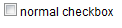
Below is a normal ZK Checkbox:
<zk>
 <checkbox label="normal checkbox" />
</zk>
It works well and looks... normal, sometimes we want make it fancy.
View Demo Online
http://screencast.com/t/7YQyHc1X
How to style it? There are several steps, described as follows:
Step 1: Throw out the normal checkbox.
ZK already separate the checkbox and label as follows:
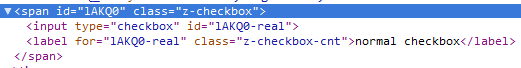
We want replace the checkbox element with a fancy one, we have to throw it out at first. We can not just drop it because already a bunch of function depends on it.
We do it by using zk.afterLoad client side API to override the bind_ method of ZK Checkbox.
The checkbox after this step becomes:
<zk>
    <script type="text/javascript"><![CDATA[
        zk.afterLoad("zul.wgt", function () {
            // store the old bind_ method
            var oldBind_ = zul.wgt.Checkbox.prototype.bind_;
            zul.wgt.Checkbox.prototype.bind_ = function (desktop) {
                // do the old bind_ method first
                oldBind_.apply(this, arguments);
                // get the checkbox element,
                // the $n(surfix) get the element which
                // id is 'Component_id' + '-surfix'
                var checkbox = this.$n('real');
                if (checkbox) {
                    // throw it out
                    checkbox.style.position = 'absolute';
                    checkbox.style.left = '-9000px';
                }
            };
        });
    ]]></script>
    <checkbox label="normal checkbox" />
</zk>

The box is out of the screen, we can only see the label.
Step 2: Add the fancy element before the label.
The next step is add a fancy element as the box of the fancy checkbox.
The checkbox after this step becomes:
<zk>
    <script type="text/javascript"><![CDATA[
        zk.afterLoad("zul.wgt", function () {
            // store the old bind_ method
            var oldBind_ = zul.wgt.Checkbox.prototype.bind_;
            zul.wgt.Checkbox.prototype.bind_ = function (desktop) {
                // do the old bind_ method first
                oldBind_.apply(this, arguments);
                // get the checkbox element,
                // the $n(surfix) get the element which
                // id is 'Component_id' + '-surfix'
                var checkbox = this.$n('real');
                if (checkbox) {
                    // throw it out
                    checkbox.style.position = 'absolute';
                    checkbox.style.left = '-9000px';

                    var cls = 'fancy_default';
                    if (zk.ie < 8)
                        cls += ' fixinline';
                    // add fancy element after checkbox element
                    jq(checkbox).after('<div id="'
                            +this.uuid+'-fancy" class="'
                            +cls+'"></div>');
                }
            };
        });
    ]]></script>
    <style>
        .fixinline {
            display: inline;
        }
        .fancy_default {
            display: inline-block;
            height: 15px;
            width: 15px;
            margin-right: 2px;
            background-repeat: no-repeat;
            background-image: url('img/fancy_default.png');
        }
        .fancy_over {
            background-image: url('img/fancy_over.png');
        }
        .fancy_down {
            background-image: url('img/fancy_down.png');
        }
        .fancy_checked {
            background-image: url('img/fancy_checked.png');
        }
        .fancy_disabled {
            background-color: #AAFFAA;
        }
    </style>
    <checkbox label="fancy checkbox" />
</zk>

only the fancy default displayed now.
Step 3: Add the event with respect to each status.
To make it active, the event control is required.
Add style with mouseover/mousedown event and remove it while mouseout/mouseup,
also sync the checked/disabled status from the normal checkbox.
<zk>
    <script type="text/javascript"><![CDATA[
        zk.afterLoad("zul.wgt", function () {
            // store the old bind_ and setDisabled method
            var oldBind_ = zul.wgt.Checkbox.prototype.bind_;
            var oldSetDisabled = zul.wgt.Checkbox.prototype.setDisabled;
            zul.wgt.Checkbox.prototype.bind_ = function (desktop) {
                // do the old bind_ method first
                oldBind_.apply(this, arguments);
                // get the checkbox element,
                // the $n(surfix) get the element which
                // id is 'Component_id' + '-surfix'
                var checkbox = this.$n('real');
                if (checkbox) {
                    // throw it out
                    checkbox.style.position = 'absolute';
                    checkbox.style.left = '-9000px';

                    var cls = 'fancy_default';
                    if (zk.ie < 8)
                        cls += ' fixinline';
                    // add fancy element after checkbox element
                    jq(checkbox).after('<div id="'
                            +this.uuid+'-fancy" class="'
                            +cls+'"></div>');
                    var fancy = this.$n('fancy');
                    if (fancy) {
                        var $fancy = jq(fancy),
                            label = fancy.nextSibling,
                            $label = jq(label);
                        if (checkbox.checked)
                            jq(fancy).addClass('fancy_checked');
                        if (checkbox.disabled)
                            jq(fancy).addClass('fancy_disabled');
                        // change style and
                        // trigger event on original checkbox
                        // with respect to fancy checkbox's event
                        $fancy.mouseover(function () {
                            jq(checkbox).mouseover();
                            if (!$fancy.hasClass('fancy_disabled'))
                                $fancy.addClass('fancy_over');
                        });
                        $fancy.mouseout(function () {
                            jq(checkbox).mouseout();
                            $fancy.removeClass('fancy_over');
                            $fancy.removeClass('fancy_down');
                        });
                        $fancy.mousedown(function () {
                            jq(checkbox).mousedown();
                            if (!$fancy.hasClass('fancy_disabled'))
                                $fancy.addClass('fancy_down');
                        });
                        $fancy.mouseup(function () {
                            jq(checkbox).mouseup();
                            $fancy.removeClass('fancy_down');
                        });
                        $fancy.click(function(){
                            if (!$fancy.hasClass('fancy_disabled')) {
                                jq(checkbox).click();
                                if (checkbox.checked)
                                    $fancy.addClass('fancy_checked');
                                else
                                    $fancy.removeClass('fancy_checked');
                            }
                        });
                        // change fancy checkbox's style
                        // with original label's event
                        $label.mouseover(function () {
                            if (!$fancy.hasClass('fancy_disabled'))
                                $fancy.addClass('fancy_over');
                        });
                        $label.mouseout(function () {
                            $fancy.removeClass('fancy_over');
                            $fancy.removeClass('fancy_down');
                        });
                        $label.mousedown(function () {
                            if (!$fancy.hasClass('fancy_disabled'))
                                $fancy.addClass('fancy_down');
                        });
                        $label.mouseup(function () {
                            $fancy.removeClass('fancy_down');
                        });
                        $label.click(function () {
                            // change style after original click
                            setTimeout(function () {
                                if (checkbox.checked)
                                    $fancy.addClass('fancy_checked');
                                else
                                    $fancy.removeClass('fancy_checked');
                            }, 0);
                        });
                    }
                }
            };
            // sync disable status after it set by API
            zul.wgt.Checkbox.prototype.setDisabled = function (v) {
                var checkbox,
                    fancy;
                oldSetDisabled.apply(this, arguments);
                if ((checkbox = this.$n('real'))
                    && (fancy = this.$n('fancy')))
                    if (checkbox.disabled)
                        jq(fancy).addClass('fancy_disabled');
                    else
                        jq(fancy).removeClass('fancy_disabled');
            };
        });
    ]]></script>
    <style>
        .fixinline {
            display: inline;
        }
        .fancy_default {
            display: inline-block;
            height: 15px;
            width: 15px;
            margin-right: 2px;
            background-repeat: no-repeat;
            background-image: url('img/fancy_default.png');
        }
        .fancy_over {
            background-image: url('img/fancy_over.png');
        }
        .fancy_down {
            background-image: url('img/fancy_down.png');
        }
        .fancy_checked {
            background-image: url('img/fancy_checked.png');
        }
        .fancy_disabled {
            background-color: #AAFFAA;
        }
    </style>
    <checkbox label="fancy checkbox" disabled="true" checked="true" />
</zk>
Step 4: Create a test case.
After the fancy checkbox is done, we should create a use case and test it.
the test case:
<zscript>
    public void updateResult(Label result) {
        String s = "You chose: ";

        Page page = result.getPage();
        Checkbox cbx = (Checkbox)page.getFellow("bread");
        if (cbx.isChecked())
            s += "bread, ";
        cbx = (Checkbox)page.getFellow("ham");
        if (cbx.isChecked())
            s += "ham, ";
        cbx = (Checkbox)page.getFellow("beef");
        if (cbx.isChecked())
            s += "beef, ";
        result.setValue(s);
    }
</zscript>
<div height="15px" />
<checkbox label="food group">
    <attribute name="onClick">
        bread.setDisabled(!self.isChecked());
        ham.setDisabled(!self.isChecked());
        beef.setDisabled(!self.isChecked());
    </attribute>
</checkbox>
<hbox>
    <div width="10px" />
    <vbox>
        <checkbox id="bread"
            label="bread" disabled="true"
            onClick="updateResult(result);" />
        <checkbox id="ham"
            label="ham" checked="true" disabled="true"
            onClick="updateResult(result);" />
        <checkbox id="beef"
            label="beef" disabled="true"
            onClick="updateResult(result);" />
    </vbox>
</hbox>
<label id="result" value="You chose: ham," />
Download
The full resource with a demo flash can be downloaded from github
The project:
fancy_checkbox.zul is under WebContent at
https://github.com/benbai123/ZK_Practice/tree/master/Components/projects/Components_Practice/
Demo:
ZK_fancy_checkbox_demo.swf is at
https://github.com/benbai123/ZK_Practice/tree/master/Components/demos
No comments:
Post a Comment